Jump to content
  • Official Red and Black Bloc Logo

    barcenal

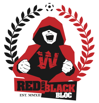
    Official Red and Black Bloc Logo


    rbblogotrans.png


    This logo best represents the raw passion and devotion a member of the RBB has for his/her club. The logo touches upon anonymity i.e. the hood leaves this person open to anyone and everyone in the RBB. The passionate expression of being in full voice connects to what the RBB will do best in the stands. "We sing for the Wanderers!". The wreath brings a more traditional element to the logo. The 'W' both stands for the 'Wanderers' as well as the 'West'. Logo design by barcenal.


    After weeks of back and forth suggestions by members of westsydneyfootball.com and many drafts by the Photoshop savvy among us the selection process for the logo that would represent the RBB and all that it stood for came down to a top 6 poll that spanned over a few days. The above logo was the winner by a large majority.


    Thank you to all that contributed with their ideas and votes. The RBB now has a logo it can chant behind and identify with. That we can wear proudly on our scarves and shirts. That we will fly high on banners and flags on the terraces in our stadium and all over the country and hopefully the world.

    User Feedback

    Recommended Comments


    Neverbloom

    Posted

    yea well ......i am wearing 2 hoodies right now :P

    GaryFish

    Posted (edited)

    Mountain folk would be the same.


    Mountain folk are like no others.

    Edited by GaryFish
    Whoops

    Posted

    has there been any wallpapers created with the new logo? or any other graphics??? wouldnt mind setting it on my computer or phone.

    Trojan

    Posted

    Maybe a massive banner of the logo to cover the back of the home end bay..

    Benched

    Posted

    Maybe a massive banner of the logo to cover the back of the home end bay..


    That would be awesome.

    Kylaia

    Posted

    Great work barcenal! Looks Fab.

    Pup55

    Posted

    i've been away for a few days, but this is so much better than the gas mask.


    i'm glad it won out !!!

    Neverbloom

    Posted (edited)

    i've been away for a few days, but this is so much better than the gas mask.


    i'm glad it won out !!!

    while i agree the gas mask was raceless, where our logo is white so i did rather the gas mask because it could be anyone where as the new logo has a fixed race but now i rather the new logo


    dont take that as a criticism that i do not like it, i love it better than the gas mask but that is the only issue i have with it but its almost perfect

    Edited by TheGoatOfDoom
    Jowel

    Posted

    .

    barcenal

    Posted

    has there been any wallpapers created with the new logo? or any other graphics??? wouldnt mind setting it on my computer or phone.


    Coming soon. :good:


    i've been away for a few days, but this is so much better than the gas mask.


    i'm glad it won out !!!

    while i agree the gas mask was raceless, where our logo is white so i did rather the gas mask because it could be anyone where as the new logo has a fixed race but now i rather the new logo


    dont take that as a criticism that i do not like it, i love it better than the gas mask but that is the only issue i have with it but its almost perfect


    Fair observation. But you see my friend, the skin colour isn't white, it's blank. So you can fill it with any colour you want. :xnod:

    Neverbloom

    Posted

    has there been any wallpapers created with the new logo? or any other graphics??? wouldnt mind setting it on my computer or phone.


    Coming soon. :good:


    i've been away for a few days, but this is so much better than the gas mask.


    i'm glad it won out !!!

    while i agree the gas mask was raceless, where our logo is white so i did rather the gas mask because it could be anyone where as the new logo has a fixed race but now i rather the new logo


    dont take that as a criticism that i do not like it, i love it better than the gas mask but that is the only issue i have with it but its almost perfect


    Fair observation. But you see my friend, the skin colour isn't white, it's blank. So you can fill it with any colour you want. :xnod:

    i did not think about that, works perfectly then thank you for the logo and actually making such great logos

    MISFIT

    Posted

    Love the logo, such a sick design

    Jowel

    Posted

    Does anyone else think that the dude in the RBB logo is actually Goat of Doom? There are so many similarities LOL

    Neverbloom

    Posted (edited)

    Does anyone else think that the dude in the RBB logo is actually Goat of Doom? There are so many similarities LOL

    the dude in the RBB logo isnt being attacked by girls or chasing girls through a park, he also isnt lighting a flare so definitely not me

    Edited by TheGoatOfDoom


    Create an account or sign in to comment

    You need to be a member in order to leave a comment

    Create an account

    Sign up for a new account in our community. It's easy!

    Register a new account

    Sign in

    Already have an account? Sign in here.

    Sign In Now


  • Posts

    • The D&O is indeed quite good. My tip however is a little further up Devonshire Street. The Shakespeare Hotel. It's a proper old school pub. With nice beer. And proper no nonsense food. Ideal for a few pre-game pints and a feed. Usually there's a something decent on the 'special' menu. Because the Light rail stop is just outside, it's possible to squeeze in an extra refreshment if required. For the Yengi 0-1 game, myself and a few other old blokes, chowed down the special Pie & Mash and got stuck into a session on Grifter      
    • Next game, i think Indonesia will have 2 suspensions, Hubner for sure and Jenner (currently on 4 yellows). I think that suspensions are for 2 yellow cards
    • From a certain point of view yes. But also looking at chances created like really the squad needs to take those chances. I think its a confidence issue more than a formation issue.
×
×
  • Create New...